Blog

Mobile-Friendly website: now it is really a requirement
2014 was the year that saw the growth, in Italy and in the world, web surfing from mobile device, to overcome the use of internet from PC. Audiweb reports data on this increase, stating that 56% of the Italian population have a smartphone connected to the Internet (26.5 milion), recording an increase of almost 70% in the last two years, while 20% browse the web through a tablet (9.5 milion)
Worldwide data is much more substantial and Google could certainly not remain indifferent. So in 2014, Mountain View engineers studied an indicator that could highlight easy-to-view sites on smartphones and tablets to facilitate a presentation of content suitable for the user’s device.
Mobile-Friendly Label
In November 2014 came the Ad: in the search results of mobile devices will appear a label that will distinguish mobile-friendly sites to inform the user if the website has been optimized for display on smartphones and tablets. So the Mobile-Friendly Label in a few weeks has definitely established itself by joining the SERP also in the Italian version of the search engine.
But let’s see what are the features that make a mobile-friendly site according to Google:
- omission of Flash animations, which are expensive in terms of battery consumption;
- Texts with clear and readable fonts without the use of zoom;
- All contents visible in the screen without the need for horizontal scrolling;
- Interactive content positioned at a sufficient distance to allow easy touch on them.

The main guidelines for a website to receive the Mobile-Friendly Label and thus be optimized for mobile devices are all described in the Introduction Guide prepared by Google.
The latter makes available for free the Mobile-Friendly Test tool which, by entering the web address of the site you want to analyze, will return a positive or negative result based on the level of optimization for smartphones and tablets.
Follow Google’s instructions for positioning…
Having a Mobile-Friendly site is really becoming a requirement not to be underestimated.
Google in addition to the label in fact, considers usability in mobile devices a rank factor to enjoy better positioning in search results than those sites that have not yet updated their layout.
…but also to facilitate users
The need, however, is not to please the Mountain View giant, but to use the guidelines and tools that Google makes available to respond to an increasing number of users from mobile devices.

The mobile version of a site must allow easy navigation inside, allowing a simple consultation to quickly find the subject of the search also from smartphones and tablets that, as you learn from the audiweb data, are increasingly used for Internet browsing.
Every user who navigates a website from a mobile device is always a potential customer: when unreadable and not easily usable content is presented to him, frustration will take over and the abandonment of the site will be almost assured.
For more information download our technical sheets or visit our site and the area dedicated to MEDIASTUDIO Services
Hashtag: #mobilefriendly #sitomobilefriendly #mobileversion #design #marketingstrategy #websitestrategy #websitedevelopment
HASHTAG
25anni 3dgraphicdesign 3dgraphics AndràTuttoBene COVID19 Firenze Fuorisalone Fuorisalone2023 Fuorisalone2024 Fvg Italy MDW2023 MDW2024 MDW24 Milano MilanoDesignWeek Modena Padova Pordenone SICAM2024 SICAMapp SaloneDelMobile SalonedelMobile2023 SalonedelMobile2024 Veneto aiuti aiutiamoadaiutare alexa amazonecho andratuttobene android anniversary app appdeveloper appdevelopment apple applehomekit applepay appmobile arckey atex brandedcontent brandreputation business cad cam casa communication components componentsfair comunedipordenone comunication connex connexindustry connexservice contentmarketing contentmarketingstrategy contract controller crawling creativitaitaliana crm cucinare2020 customercare customerrelationship cyberattacks cybersecurity dem design designweek digital digitaldevice digitalmarketing digitalstrategy digitaltools directmarketing domains domotica domotics domus4u domusline donazioni doors ecommerce ecommercebusiness ecommercedevelopment ecommercewebsite ecommercewesite electric emailmarketing emailmarketingstrategy emergenza euroluce2023 exhibition exhibitors expoconnex facebook facebookads facebookpixel fair forniturefair forniturefittings furniture furniturefittings furnitureindustry futureshop fvg google googleads googleanalytics googleassistant googlehome graphicdesign home homeautomation homographicdomains hosting hostingservices iSaloni ict ilgazzettino innovation insiemecelafaremo insiemesiamopiùforti interiordesign internationality internetprovider ios lights linkbuilding lionsclub marketingonline marketingstrategy mediadesign mediastudio messaggeroveneto meta metapixel mobile mobilefirst mobilefriendly mobileversion negozionline negozioonline netcomm newsletter oikos omnicanalità onlineadvertising onlinefrauds onlinemarketing onlineshopping onlinevisibility ospedale phishing pixel pordenone pordenonefiere positioning reputationonline responsivewebsite reviews safetycheck safetychecklist seo seooptimization shoponline shoppingonline sicam sicam2019 sicam2023 sicampordenone sitemobile sitomobilefriendly sitowebresponsive smarthome smartphone smartworking smatrphone socialmedia socialmediamarketing socialmediastrategy socialnetwork softwaredevelopment strategieweb technologies tecnologie tecnology userexperience ux visibility voice voiceassistant webadvertising webagency webanalytics webapplication webdesign webdesigner webhosting webmarketing webmarketingtools webpositioning webreputation website websitedesign websitedeveloper websitedevelopment websitestrategy webstrategy wifiYou might also like...
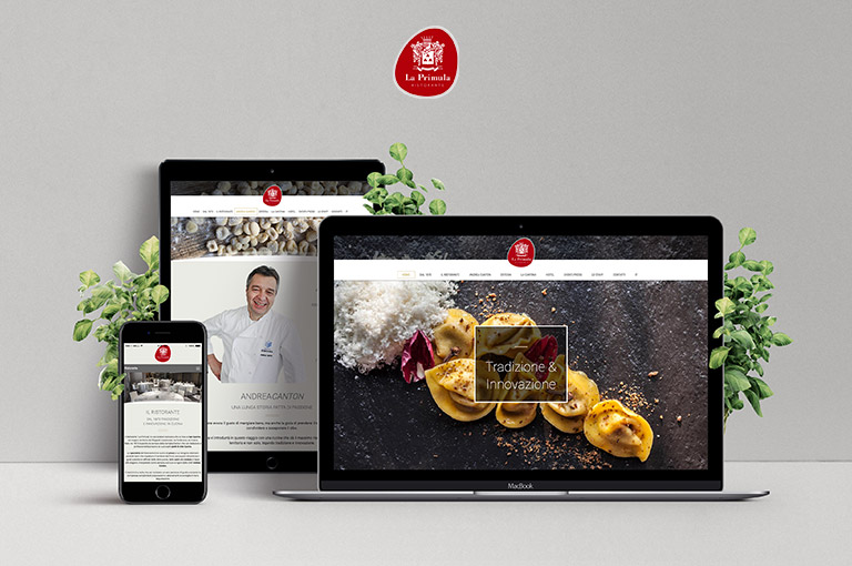
How to create an effective website
Creating a website is a metter of strategy. The key steps for designing a site that works.
Show all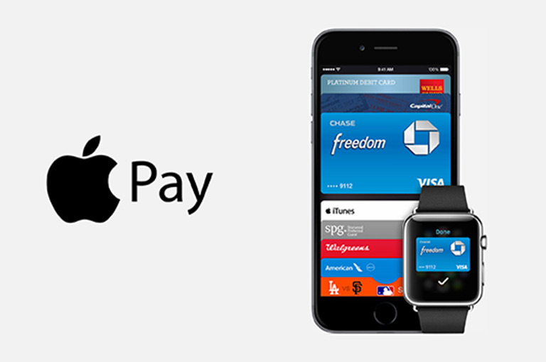
Apple Pay: how does it work? Pay with iPhone o iWatch
Fast and secure payments with Apple Pay.
Show all
App or Mobile Site?
Developing a mobile site or an App is a choice that needs to be studied and analysed on the basis of several factors.
Show all
Web Marketing and visibility
What is the best way to increase the visibility and value of a company on the web?
Show all


